
Explain the Change between any two month
I started collecting the different built-in analytics capabilities of Power BI. (You can find Part 1 and Part 2 here.) As I went through all the possibilities I found that I really miss the ability to define the 2 months I would like to compare with each other.
So I thought let's build something that can give me this functionality.
Explain the Change - Power BI Demo
You can use the time slider to select any 2 dates and this example with compare the 2 selected month with each other showing the difference across 6 dimensions using scatter plots.
Also you have the ability to select between 4 metrics (Sales, Profit, Profit %, Quantity)
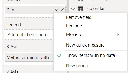
Pro Tip: In some circumstances it is useful to turn on "Show items with no data".
This way we are not losing cities that did not produced any sales in the selected period. Because that can also be a valuable information.
How to create this?
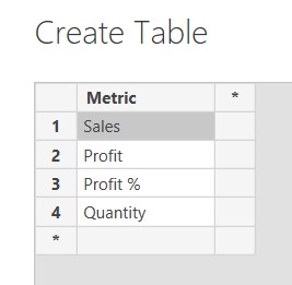
1st step: We need to create a table using Enter Data, that will hold the different measure names we want to select from.
2nd step: We need to create the measure what we can use together with a slicer to select between our desired measure. See the Selected Metric in the Dax Measures used section.
3rd step: I wanted to use a simple slider slicer with the dates to quickly select 2 months I would like to compare. So I need to create 2 measure that will calculate the first months and the last months value selected in that slicer. See the Metric for max month and Metric for min month in the Dax Measures used section.
4th step: I wanted to visuals on a line chart the values by month between the 2 selected months. Because the user will be able to select any day in the month, but I wanted to show the full month values for all the months, I had to calculate it in another measure. See the Full Month Metric in the Dax Measures used section.
5th step: Create dynamic titles for the line chart and the scatter charts. See the Title for Line Chart and Title for Scatter Charts in the Dax Measures used section.
Dax Measures used
Selected Metric = SWITCH(SELECTEDVALUE('Metric Selector'[Metric],"Sales"),"Sales", [£ Sales],"Profit",[£ Profit],"Profit %", [% Profit], "Quantity", [# Quantity])
Metric for max month = var maxdate = [MaxDate] return CALCULATE([Selected Metric], filter(ALL('Calendar'[Dates]), MONTH('Calendar'[Dates]) = MONTH(maxdate) && YEAR('Calendar'[Dates]) = YEAR(maxdate)))
Metric for min month = var mindate = [MinDate] return CALCULATE([Selected Metric], filter(ALL('Calendar'[Dates]), MONTH('Calendar'[Dates]) = MONTH(mindate) && YEAR('Calendar'[Dates]) = YEAR(mindate)))
Full Month metric = CALCULATE('Metric Selector'[Selected Metric], all('Calendar'), VALUES('Calendar'[Year Month]))
Title for Line Chart = SELECTEDVALUE('Metric Selector'[Metric],"Sales") & " by Year, Quarter and Month"
Title for Scatter Charts = SELECTEDVALUE('Metric Selector'[Metric],"Sales") & " comparison between " & MONTH([MinDate]) &"/"& year([MinDate]) & " and " & MONTH([MaxDate]) &"/"& year([MaxDate])